New chat
Search chats
Transit studio
Library
Sources
Pinned

Recents

Jon Rodriguez
VIA Metropolitan
Library /
January Service Signup Comparison
Share
Planner Metrics
7/7/2024 - 11/12/2024
bundled_current (active)
Period
Scheduled Snapshot
300,000
300,000
300,000
300,000
300,000
300,000
300,000
300,000
0
552
552
552
552
552
552
552
552
552
552
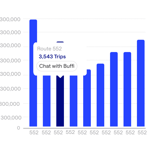
Route 552
3,543 Boardings
Chat with Buffi
Top Routes by Boarding
27,848,552
Boardings
98 routes - 322 service days
Top Routes by Scheduled Trips
27,848,552
Scheduled Trips
89 routes in bundled_current
Shortest Avg. Headway
-
Avg. Headways
Needs frequencies txt in this GTFS feed *
No frequency-based headways in this snapshot
Buffi Alpha v0.0.5
Show me the current San Pedro Route 20.
I've opened the current San Pedro Route 20. Ask me to compare another service signup, identify route changes, or analyze ridership along the corridor.
Current Route 20
Jul 13, 10:32 PM
Open
Sources
How did ridership change after the January service signup?
Weekday ridership increased after the January service signup, with the largest gains during the afternoon peak. I've created a ridership comparison between the previous and current service signups.
January Service Signup Comparison
Jul 13, 10:53 PM
Sources
Show me boarding data from a year period starting july 13th 2025
The January service signup is projected to increase Route 20 ridership primarily because service became more useful for everyday commuting hours.
Sources
Which neighborhoods benefited the mo|
Buffi Alpha v0.0.5
Hi Via,
What should we dive into?
Which routes had the highest ridership in 2023?
What did the route look like that had the peak ridership on San Pedro Ave?
Summarize the uploaded datasets I have access to
Based on your uploaded sources
Placeholder
Visualization Canvas
Ask any question and the best visual for your question will appear here.
Review Sources
Chat to visualize

Role
Product Designer
Translated research insights into user flows, wireframes, and final UI, collaborating closely with engineers to hand off designs and bring Buffi from concept to a fully functional platform.
Timeline
10 week Cohort
Summer 2026 ·
Internship
Summer 2026 Internship
Better Futures Insititute
Context
VIA Metropolitan Transit's planners have to prove service is working — to their board and their funders. Those answers lived in an uncentralized system, spread across models, spreadsheets, and mapping platforms. Over the internship we designed Buffi, an AI-powered data analytics product for VIA's scheduling and planning team.
BUFFI
Design Team
Itzel Pulido
Saulo Jimenez
Jonathan Rodriguez
Tools
Figma
Figjam
Figma Make
Github
CodeX
Claude
Claude Design


01 The Problem
VIA came to us with an overarching challenge in their current system: the answers planners needed existed, but never in one place.
Ridership data lived in one platform, forecasts in another, and geographic analysis in a third. Every question a planner asked turned into a request, a hand-off, and a wait.


We ran 1:1 interviews with the two teams who would live inside this product every day.
CORE USER GROUP
Data Analyst Team
Fields incoming requests, runs the models, and slices raw data into whatever format the planners need.
CORE USER GROUP
Service Planner Team
Designs and defends route changes, and needs evidence that a change worked once it is on the street.
02 Direction
We uncovered four specific pain points
01
No Standardized Forecasting Method
“No one in our department has really set a standardized method of forecasting”
“Because we don't have a standardized way of doing any kind of forecasting, it makes it difficult to know which model to put into our analysis.”
“We don't have a standardized way of doing any kind of forecasting at the moment, especially from a route by route and a signup by signup basis.”
02
Current Model Inconsistencies & Frustration
“T-Best is more like what will a scenario look like for your network like 5 years from now... you're not going to get good results if you say I want to look at what ridership on this route would look like 6 months from now.”
“The T best model does take a while to run. It takes a number of steps to get to.”
“It takes quite a bit of leg work in order to provide the networks... you give the T best model all of the networks that you're trying to compare, and then from there runs it. So that's probably the biggest bottleneck is how long that model takes.”
03
Slow, Manual Data Requests
"Most of the time, if a planner needs some data or an analysis done, they come to us [data analyst], and depending on how they want to handle it, we either do the analysis or give them the raw data to do whatever they want with."
" Sometimes we [scheduling & planning team] have some weird slicing we need to do that we can't do on our own — the data's available, but in a format we're not accustomed to, so we need it sliced a particular way."
"Any planners with requests or deliverables that require more analysis than the available dashboards can provide — if it's something we can do ourselves, we will, but a lot of times we'll reach out to Andrew or Ruben and their teams to slice it the way we need."
04
Data Integration Across Platforms
"The bottleneck in that case is the actual data. If you're comparing individual routes from one sign-up to the other, you want to see the overall and then the individual stops:...Processing that data and making it usable is the challenge, because they use different platforms — ArcGIS, our map, or Remix. "
“You have to have a dashboard that allows you to make these filters, access the data, and then process the data on the back end so they can either get a table or a shape file that they can use on the platform.”
They also laid out what they thought could be the ideal fix.
“Maybe they'll be able to select multiple routes at once as well. So if I'm gonna go, like, route by route, look at... and different patterns of the direct...”
“And being able to evolve as things change — because a lot of the changes we make to the network come from community feedback. Being able to provide what those changes are and then see how they impact ridership downstream.”
“Ideally with this tool,
they'd be able to export the data they're seeing in the platform — to bypass the step of having to come to me or Ruben and say ‘I need this data’ or ‘I need this map.’ Ideally this tool gets the stuff they need into their hands a lot quicker.”
Ideating an ideal fix was the easy part. The real question was where to start - so we built on the foundation from the previous cohort.
A lot of that foundation was already really strong, especially the idea of having Buffi as an AI-powered workspace. So rather than completely changing that experience, we focused on building on top of it and making it better suited for VIA's specific needs. Taking a prebuilt demo system and molding it to match VIA's needs meant mass amounts of changes had to be made and polished.

Interactive
Maps
Route
Changes
Predictive
Forecasting
AI- Powered
queries
Before-and-after analysis
03 Research & Flows
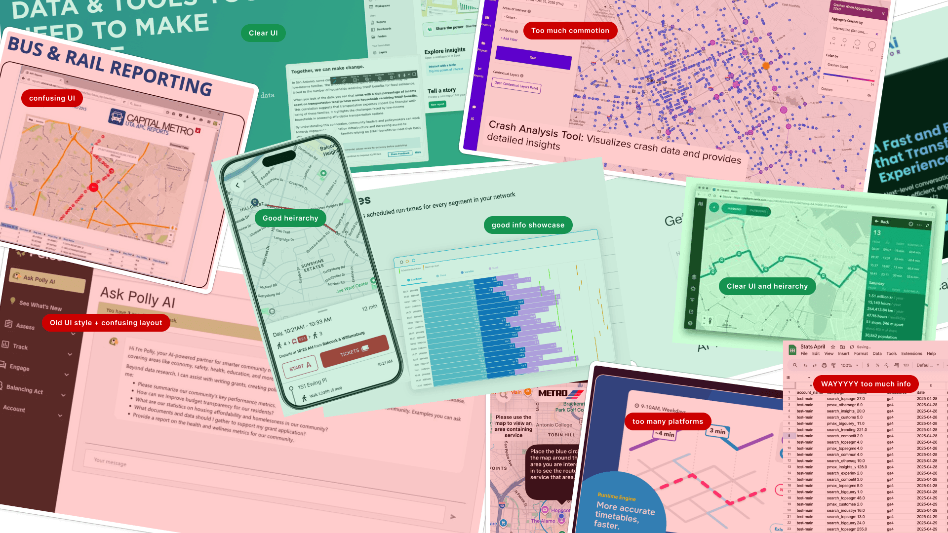
We audited comparable AI and transit tools, plus the systems VIA already uses
Then determined what had been working well and what hadn't — which set the bar for what Buffi needed to match and where it could clearly do better.
How would users navigate the platform and accomplish key tasks?
We created user flows and journey maps to answer that — mapping the questions a planner would ask, the decisions the system had to make in response, and the moments where the old process broke down.

User Flow- Forecasting & Comparison paths
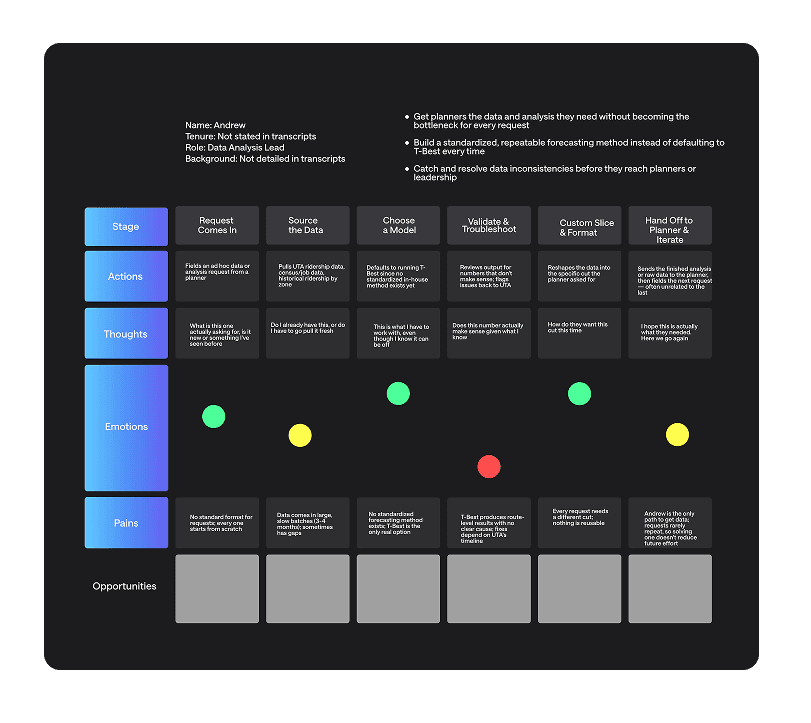
JOURNEY MAP - Data analyst

JOURNEY MAP - Service Planner
04 Designing the Platform
Once we understood what VIA needed from the platform and what users needed from the experience, we could get to designing.
We kept familiar features like New Chat and Search Chat, while maintaining the original idea of Buffi as a conversational AI agent. From there, we used our Forecasting and Comparison user flows to think through how a planner might actually use Buffi — from the questions they would ask to the data and visualizations they could receive in response.
New Chat
Start a new conversation with Buffi to ask questions, explore data, or visualize insights
Search Chat
Quickly find previous conversations across your chat history
Library
Access saved visuals, and other content created through chat
Sources
Upload and manage the data AI uses, including GTFS files, ridership data, spreadsheets, and other datasets
Introducing Transit Studio
Then we added Transit Studio to the navigation — the main new feature of Buffi.
Transit Studio
A centralized workspace for planners to view, visualize, and export transit data.
Buffi is conversational: ask a question and get an answer. Transit Studio is dashboard-driven, giving planners instant access to the routes, metrics, comparisons, and visualizations they use most.
Five tabs, five visualized dashboards
Data has been modified for portfolio presentation in accordance with NDA requirements.
Overview
Provides a high-level look at the transit system, bringing together key ridership data, performance trends, and visualizations so planners can quickly understand what is happening across the network.
Routes
Comparisons
Metrics
Forecasting

Every tab is still a chat
The dashboard answers what is happening; Buffi answers why. Any data point in the studio carries a “Chat with Buffi” affordance, which opens the conversation beside the view it came from — chat on one side, the studio tab on the other — so a planner can question a number without losing the chart it sits in.


And every planner arranges the board their own way
Overview widgets can be added, removed, resized, and rearranged, and the result saved as a named layout. Planners who live in forecasting and planners who live in route maps get the same product and a different first screen — and can switch back to a preset at any time.
Final Design
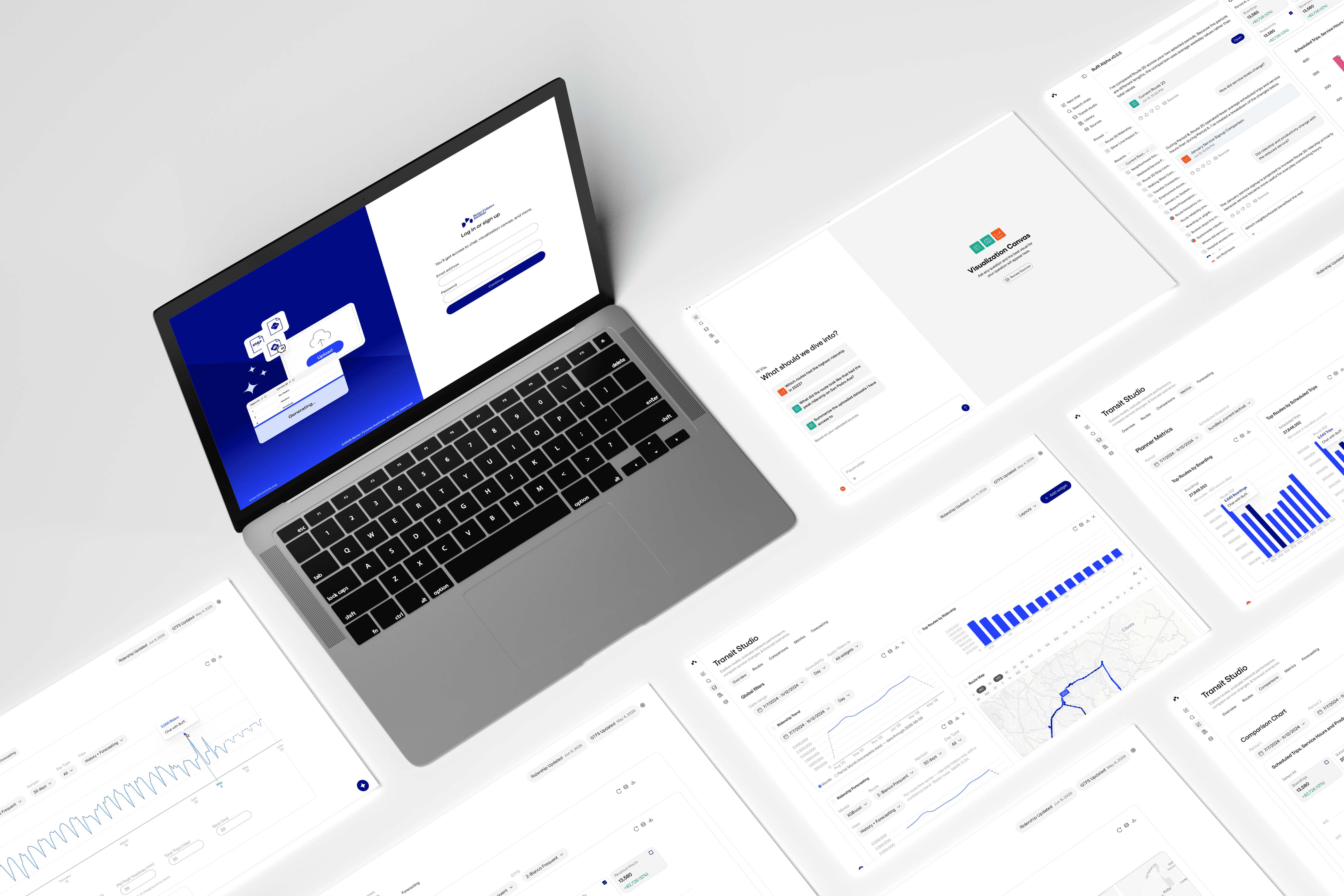
Buffi ended the cohort as two halves of one product: a conversational agent for the questions planners can't anticipate, and Transit Studio for the answers they need every week. Ridership maps, before-and-after analysis, forecasting, and AI-powered queries now sit in the same workspace, drawing from VIA's own GTFS and ridership data.
05 Final
Outcome & Impact
ONE PLACE
nteractive ridership maps, before-and-after route analysis, predictive forecasting, and AI-powered queries, everything a VIA planner would need, now in a single workspace.
FEWER HAND-OFFS
Planners can reach and export the data themselves instead of routing every question through the analyst team.
BUILT TO CONTINUE
Because the AI does the interpreting, Buffi isn't bound to one agency. Another organization can plug in its own data and get the same workspace shaped around it — the way we shaped this one around VIA.
Key Takeaways
VIA's planners now work inside the product day to day — opening Transit Studio to check ridership, compare signups, and pull their own exports. The hard part was never imagining the fix. It was deciding what to keep, and making an inherited system feel like it was built for VIA all along.

More Work

