
Role
Team Lead, UI/UX Designer
Timeline
10 weeks
Fall 2025 · Class Project
UX 101 Class Project
2025
Context
Big Bon Bodega is a local restaurant with strong in-person branding, but a confusing online ordering experience. We redesigned the site to make ordering clear, easy, and worth choosing over third-party apps.
Guided research, facilitated collaboration, designed wireframes and final UI
Team
Ruth Moran
Nico Garcia Bahamonde
Isabella Piazza
Tools
Figma
Figjam
Figma Make
Photoshop
Procreate
Big Bon Bodega
Capcut


01 The problem
Third-party platforms hurt local restaurants
Big Bon Bodega depends on takeout for 60% of revenue. Third-party platforms take up to 30% in fees per order, cutting deeply into margins.
60%
Revenue from takeout
30%
Fees to third-party apps
0%
Fees on direct orders
Beyond just fees
Third-party platforms also dilute brand control, create extra steps for customers, and prevent restaurants from building direct relationships with their most loyal customers.
For a local business like Big Bon Bodega, every order placed through DoorDash or Uber Eats is a missed opportunity to retain revenue and strengthen customer loyalty.
Design Challenge
Make Big Bon Bodega's direct ordering experience easier and more rewarding than third-party platforms
02 Research & Insights
"People choose third-party apps because they're familiar, fast, and remember their preferences—not because they prefer them"
Key insight from user research
01
Speed and convenience drive behavior
Users gravitate toward platforms that remember their payment info, address, and past orders. Direct ordering sites that require re-entering this information lose out.
02
Extra steps cause abandonment
Every additional form field, unclear button, or confusing navigation step increases the likelihood users will default to a third-party app instead.
03
Incentives matter—if they're visible
Users are willing to order directly if there's a clear benefit: rewards, exclusive items, or better prices. But these benefits need to be surfaced early and often.
Critical Realization
To compete with third-party apps, the direct ordering experience must be faster, easier, and more rewarding
Design Strategy
Making direct ordering the easier choice
The redesign focused on reducing friction for returning customers by removing barriers that make third-party apps feel faster.
Key Iteration Focus
Remember saved cards
Users shouldn't need to re-enter payment information on every order. Saved payment methods make checkout as fast as third-party platforms.
Location pinning
Returning customers can save delivery addresses and quickly reorder to saved locations, eliminating repetitive form-filling.
Fewer checkout steps
Simplified flow from menu to confirmation. Every removed step increases the likelihood of completed orders.
Optimized for returning users
Reorder past favorites, view order history, and jump straight to checkout with saved preferences.
Each feature was designed to answer one question: Why would someone choose to order directly instead of through a third-party app?
Product Strategy
Incentives as product decisions
UX alone isn't enough. To shift behavior, we paired better usability with tangible rewards that make direct ordering more valuable.
"These aren't marketing features—they're product decisions designed to change user behavior"
Reward points for direct orders
Customers earn points on every direct order that can be redeemed for discounts. Third-party orders don't earn rewards, creating a clear incentive to order directly.
Bagel of the Month exclusives
Special seasonal items available only through direct orders. Creates FOMO and gives customers a reason to visit the site directly.
Online-exclusive seasonal menus
Limited-time menu items only accessible through the direct ordering site, driving repeat visits and creating differentiation from third-party platforms.
Direct-order promotions
Special discounts and free delivery offers available only when ordering directly, making it financially advantageous to skip third-party apps.
Strategic Insight
Better UX removes friction. Incentives provide motivation. Together, they shift behavior.
03 Information Architecture
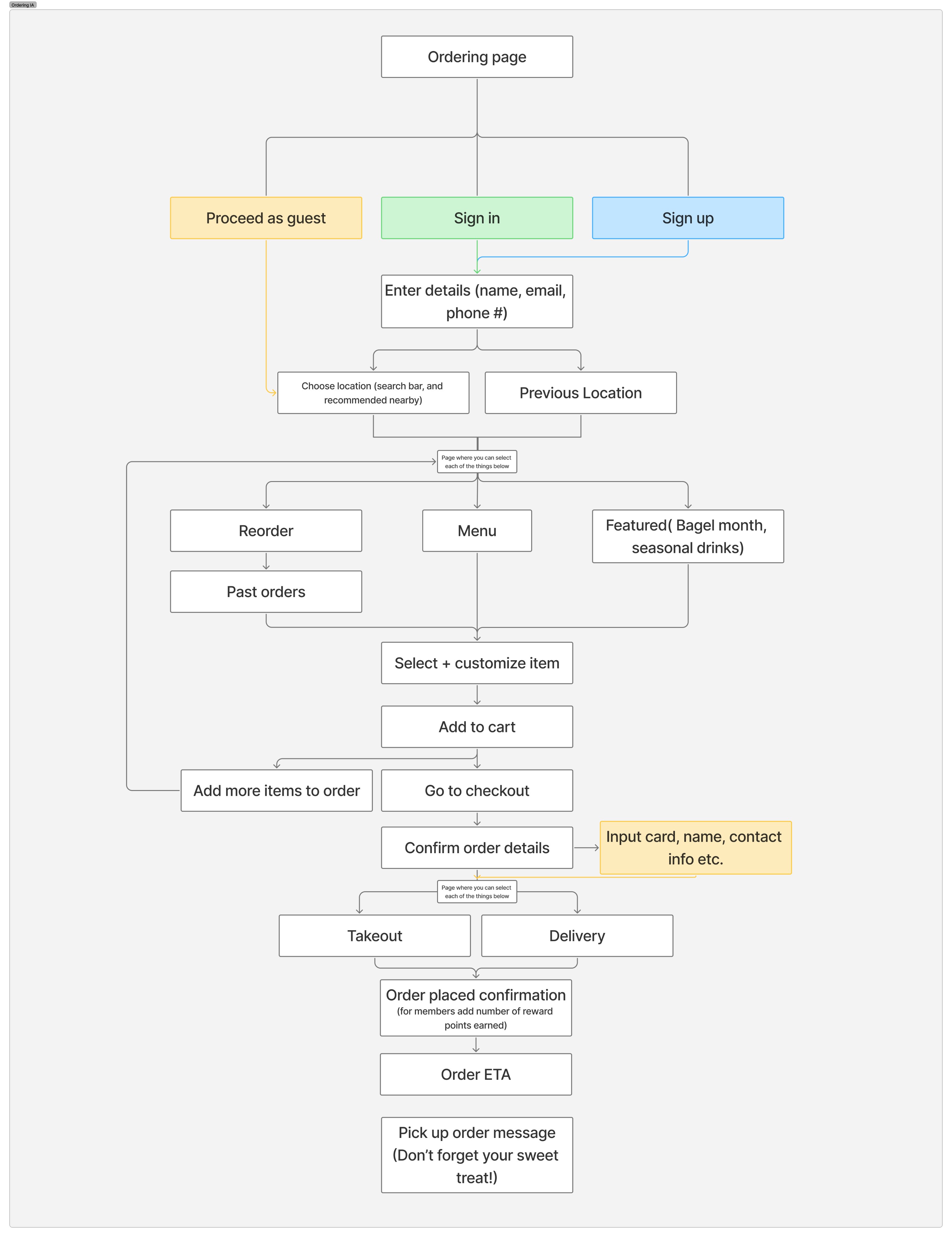
Streamlined checkout flow
The new structure reduces steps from landing to order confirmation, making the experience as fast as third-party apps.
Before
×
Re-enter payment every order
×
Retype delivery address each time
×
5+ steps to complete checkout
×
No reorder functionality
After
✓
Saved payment methods
✓
Pinned delivery locations
✓
2-step checkout for returning users
✓
One-tap reorder from history
Optimized User Flow
Returning Customer Path
Saved preferences + one-tap reorder = faster than third-party apps
Structural Focus
Persistent saved info access
Payment and location information visible and editable at all times, building confidence
Reorder prominence
Past orders surfaced early in the flow for quick one-tap reordering
Rewards visibility
Points balance and available rewards shown throughout, reinforcing direct ordering benefits
"Structure matters more than polish when validating product decisions"
04 Wireframes
Testing structure and hierarchy
For returning customers with saved payment and location, checkout becomes a 2-step process: review order → confirm
Low-fidelity wireframes focused on validating the streamlined flow and ensuring saved preferences were clearly surfaced.

05 Usability Testing
Validation & iteration
Testing Method
Two realistic ordering tasks focused on flow, customization, and checkout confidence
What Worked
Simple, intuitive UI reduced cognitive load
Reorder features saved time for returning users
Clear button hierarchy guided actions
Pain Points
Quantity adjustment wasn't intuitive
Customization options lacked interactivity
Confusion between new vs. reorder flows
Changes Made
Iterations based on real user feedback
Added adjustable quantity controls
Made customization interactive with visual feedback
Clarified new order vs. reorder paths
Added clickable star ratings on reviews
Final Design
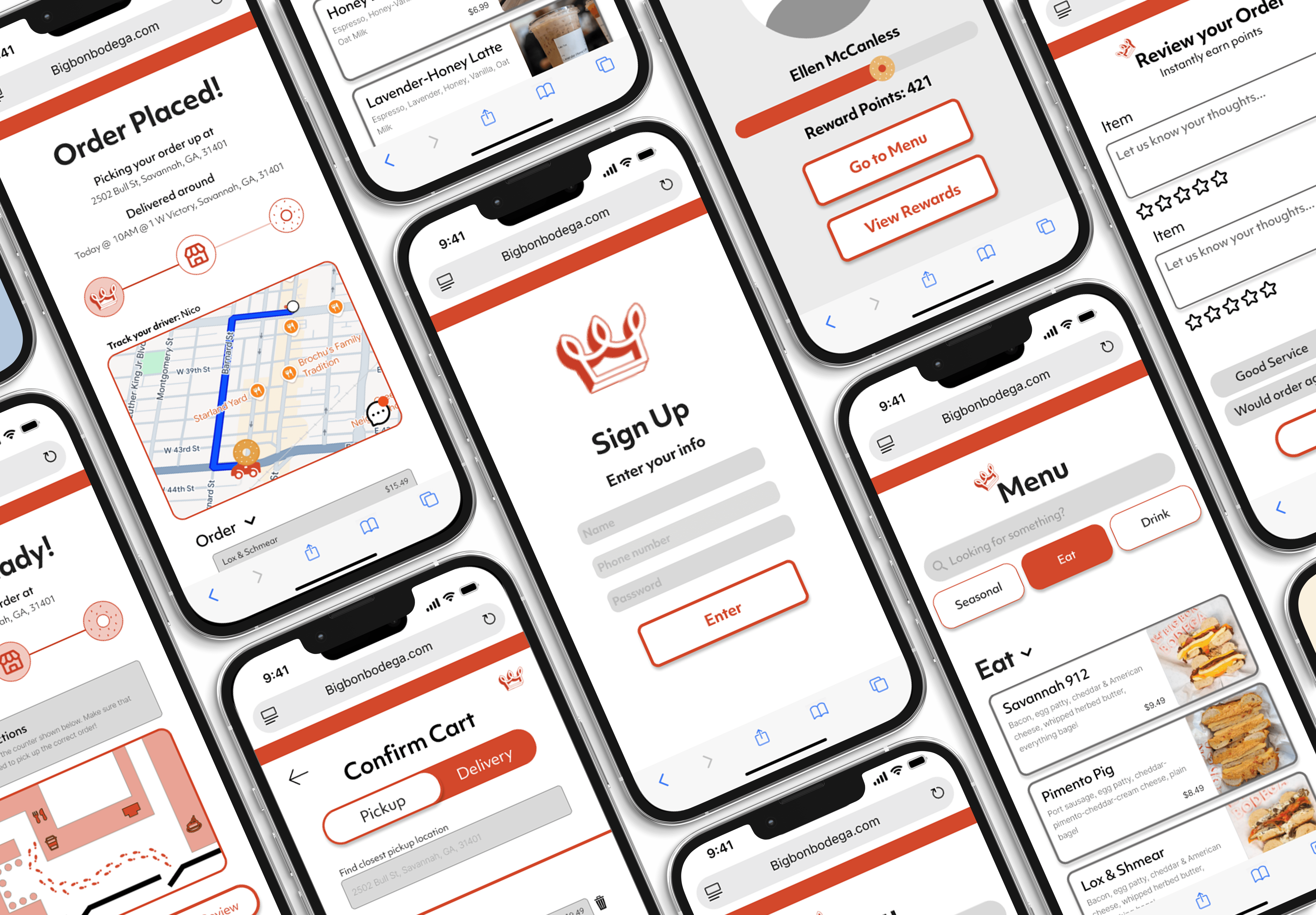
Bringing the experience to life with an interface that feels friendly, approachable, and aligned with Big Bon Bodega's brand.

Visual Goals
•
Reflect Big Bon Bodega's warm, playful brand digitally
•
Make ordering feel welcoming, not transactional
•
Keep the interface clean and readable on mobile
•
Support confident checkout without clutter
Design Decisions
•
Visual emphasis on primary actions like ordering
•
Clear styling for interactive customization options
•
Calm, straightforward checkout screens
•
Visual feedback for successful actions

06 Final
Warm & Welcoming
Visual identity reflects the in-person experience
Fast & Clear
No clutter, just confident ordering paths
Mobile-First
Optimized for where orders actually happen
Final Prototype
From landing to checkout in under 60 seconds
The complete ordering journey—tested, refined, and ready to compete with third-party platforms
Outcome & Impact
Better UX
Simplified ordering flow with clearer navigation and reduced friction points
Business Impact
Positioned direct ordering as a viable alternative to third-party platforms
Customer Experience
Created a welcoming, confident ordering experience that reflects the brand
Beyond the Classroom
This project evolved beyond a class assignment. Our redesign caught the attention of the Big Bon Bodega team, opening conversations about how thoughtful UX could support their business goals around direct ordering.
As a result, my team and I were invited to collaborate on their new startup restaurant, Miss Sophie's, applying the same user-focused approach to a real-world project.
This experience reinforced the value of designing with both users and businesses in mind—showing how strong UX decisions can create momentum beyond the classroom and turn academic work into professional opportunities.
Key Takeaways
Design Process
Strong research and iteration create designs that solve real problems, not just look good.
Business Value
Understanding business goals helps UX designers create solutions that drive actual impact.
User-Centered
Small friction points matter. Removing them can dramatically improve conversion and confidence.
Collaboration
Leading a team requires balancing vision with feedback and keeping everyone aligned on goals.
Outcome & Impact
Better UX
Simplified ordering flow with clearer navigation and reduced friction points
Business Impact
Positioned direct ordering as a viable alternative to third-party platforms
Customer Experience
Created a welcoming, confident ordering experience that reflects the brand
Beyond the Classroom
This project evolved beyond a class assignment. Our redesign caught the attention of the Big Bon Bodega team, opening conversations about how thoughtful UX could support their business goals around direct ordering.
As a result, my team and I were invited to collaborate on their new startup restaurant, Miss Sophie's, applying the same user-focused approach to a real-world project.
This experience reinforced the value of designing with both users and businesses in mind—showing how strong UX decisions can create momentum beyond the classroom and turn academic work into professional opportunities.
Key Takeaways
Design Process
Strong research and iteration create designs that solve real problems, not just look good.
Business Value
Understanding business goals helps UX designers create solutions that drive actual impact.
User-Centered
Small friction points matter. Removing them can dramatically improve conversion and confidence.
Collaboration
Leading a team requires balancing vision with feedback and keeping everyone aligned on goals.

